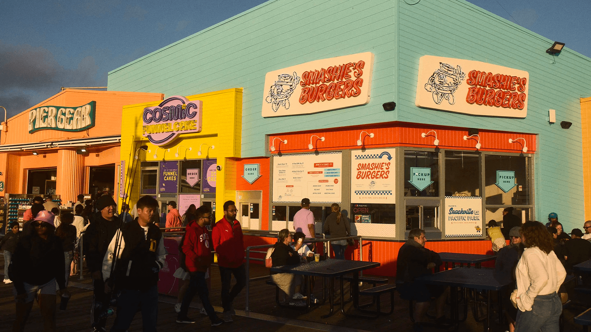
Snackville at Pacific Park
Branding & identity for the reimagined food court at the iconic Santa Monica Pier.
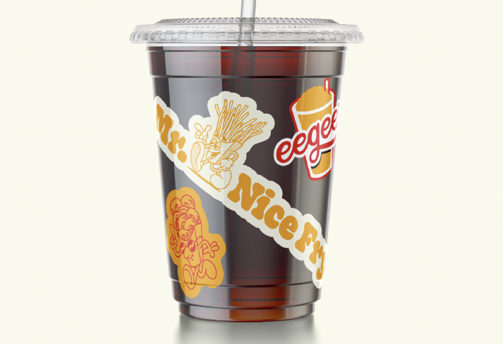
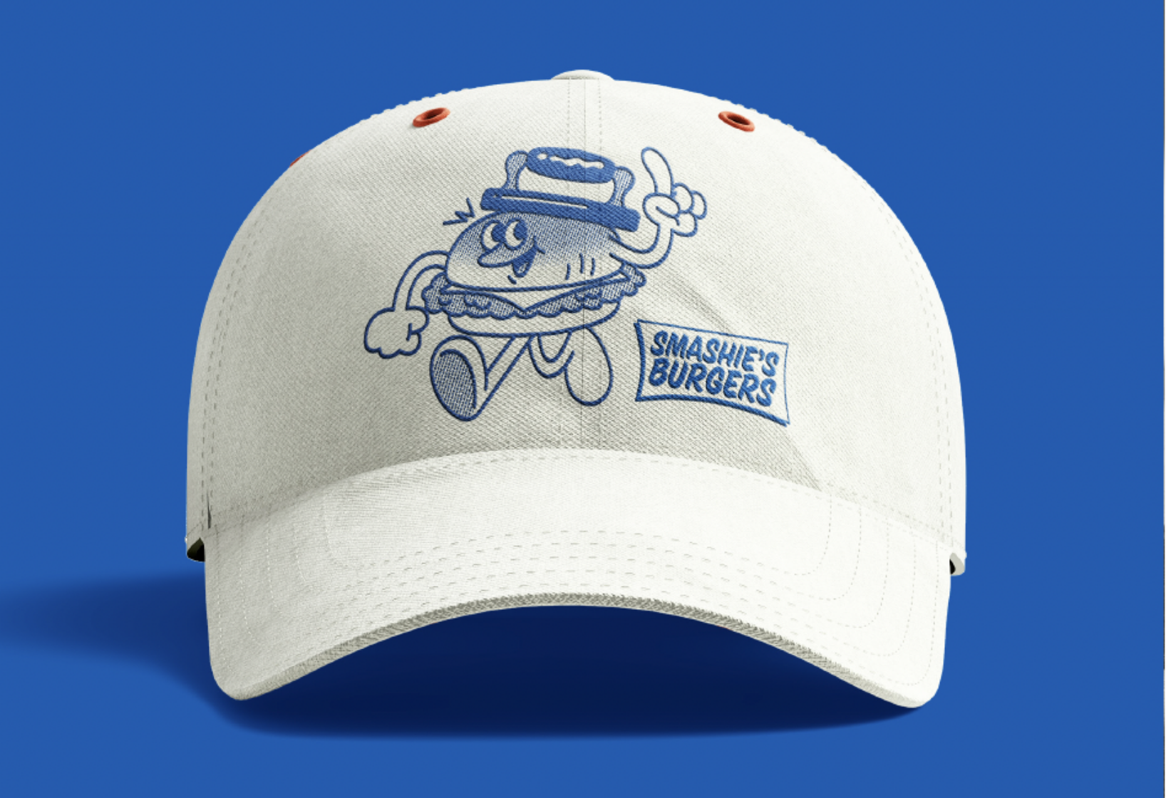
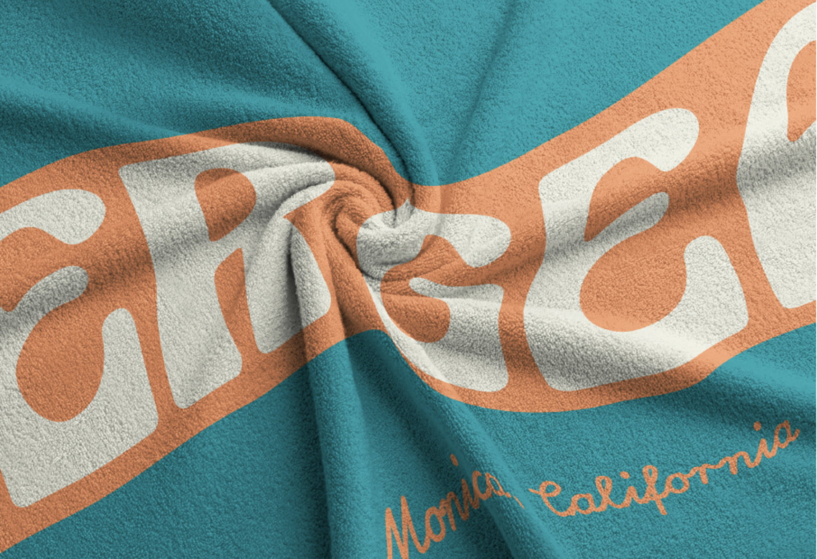
I was brought onto this project to help develop the brand identities for the businesses that live at Snackville at Pacific Park. The project focused on logos, typography, color palettes, and applications, which included exteriors, menus, and merch.
Agency: Zan Inc
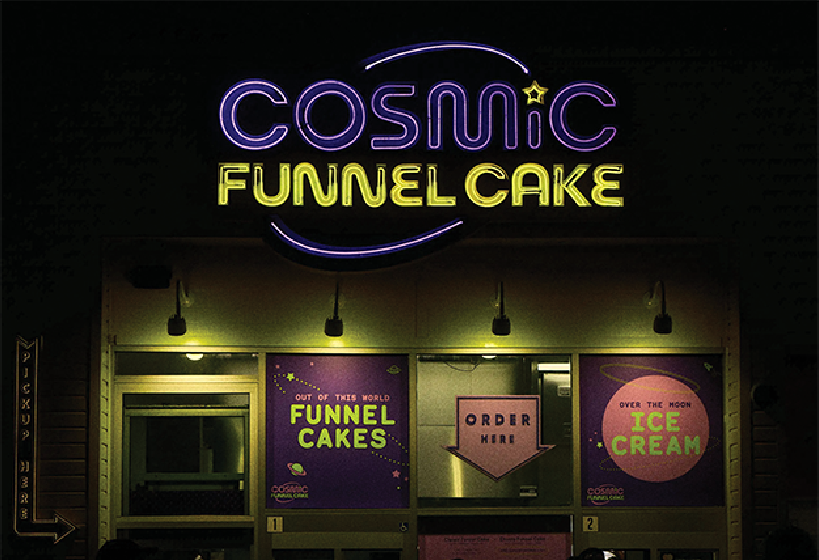
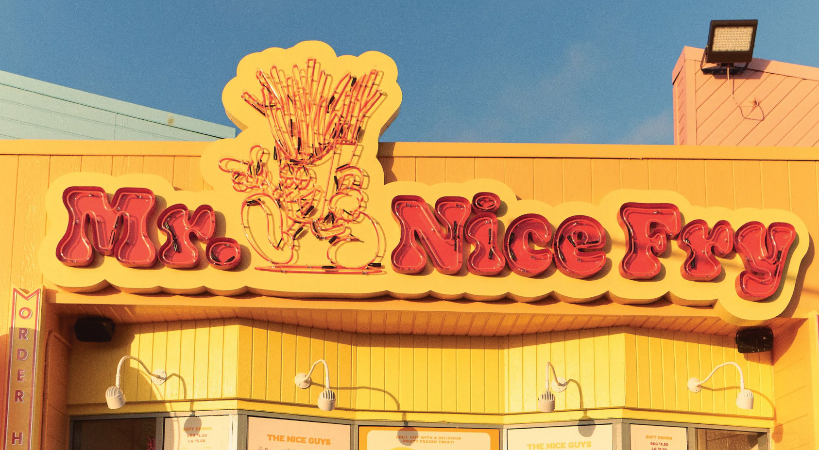
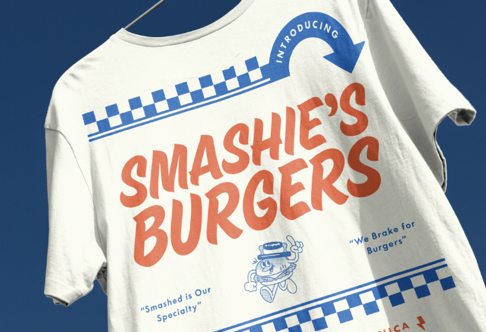
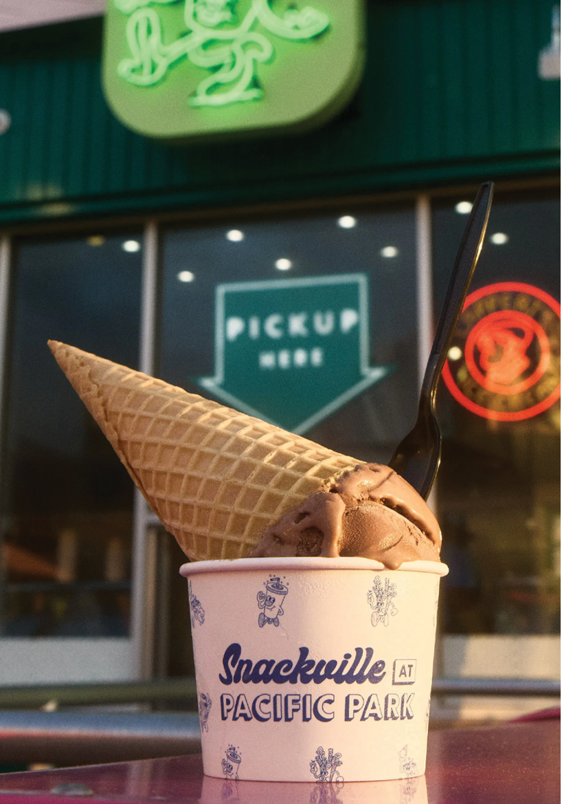
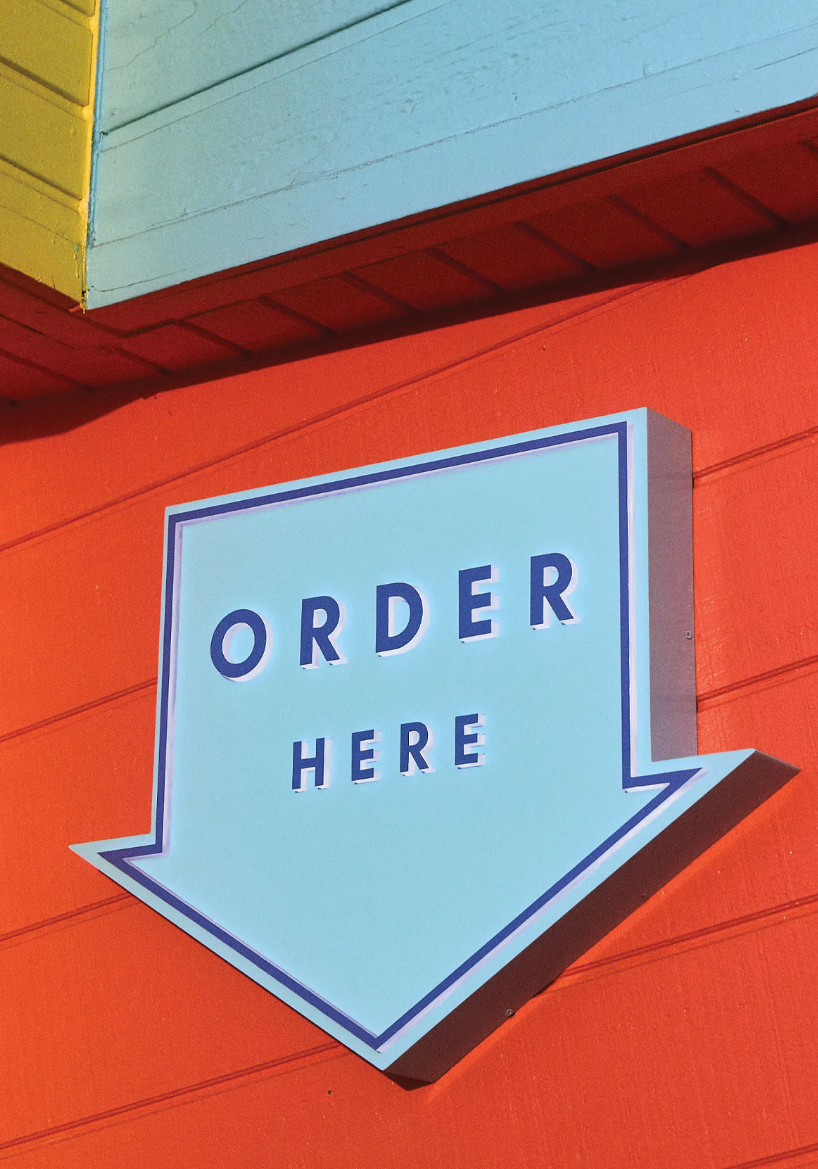
The client tasked us with creating design systems that stayed consistent and true to their Los Angeles roots. In our designs we had the challenge of creating clear wayfinding signage and typography to ensure an inviting and approachable experience for people of all backgrounds. The visual language we created is both playful and bold, crafted to enhance an in-person experience that offers quick and accessible food for all.
The design system we created includes a range of printed objects from neon signs to wax paper. Each of the brands showcases their own distinct designs and color schemes. This allows them to stand alone while remaining interconnected, creating a cohesive home for Snackville at Pacific Park.
